

The first time you look at crypto price charts, they may look like hieroglyphics to you. But the good news is price charts are actually easier to read than you may think.
In this guide, you will learn how to read charts, and how to use some basic technical analysis tools that you can use to help you make trading decisions.
Line and Candlestick Charts
You probably remember line charts from high school. They work the same way on a digital currency chart as they do while graphing other things that change over time.
On the horizontal (X) axis is time, and the price is measured on the vertical (Y) axis. To check the price of an asset at a given time, you just have to look for the time you want on the X-axis and look straight up to see the price of the asset at that moment.
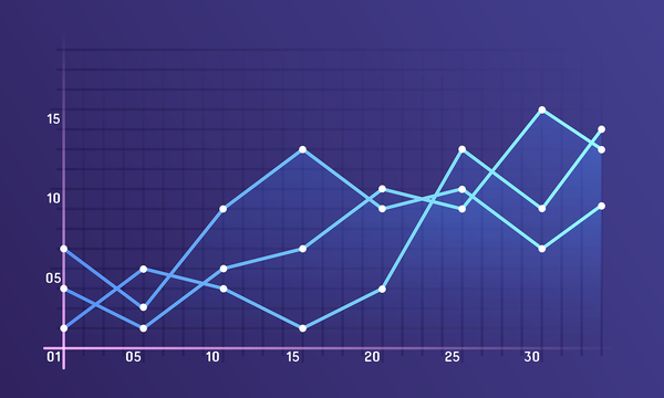
You can dig a little deeper by analyzing the slope of the lines between two sets of price points with the same time period. The steeper the angle of the line, the faster the price went up or down, which may indicate how strong the price action was.
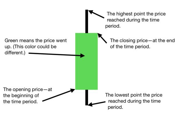
Line charts, however, only tell you so much. Candlestick charts provide far more information. Below, you can see what a candlestick looks like, and what it tells you.
Support and Resistance
You may often see straight lines overlaid on a chart, crossing the apexes of hills or valleys—particularly when someone is analyzing price action or trends. These are called support and resistance lines.
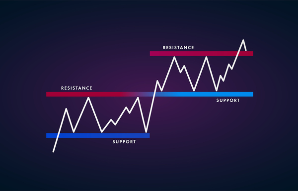
What Support Lines Mean
A line of support is drawn across points where the price bottomed out before rebounding up again. At each of these points, even though traders had been selling and pushing the price down, there were enough buyers to reverse the downward trend. This is often because the price got so low, buyers couldn’t resist getting in on the deal.
When a series of these points can be connected with a single line, it can be extrapolated—or drawn past the current price—to predict the next price at which buyers will get back in the game. In this way, they “support” the price.
What Resistance Lines Mean
Resistance lines are the opposite of support lines. A resistance line is drawn through several points where the price peaks, buyers stop buying, and sellers jump in, driving the price down. They can be used to try to gauge where the next bull trend may come to an end.
Digital Asset Technical Analysis for Beginners
Technical analysis involves using historical price graphs to predict what could happen to the price of an asset or a security. Arguably, the most popular technical analysis tools that can be used with digital assets include moving averages, MACD, Bollinger Bands, and RSI.
Moving Averages
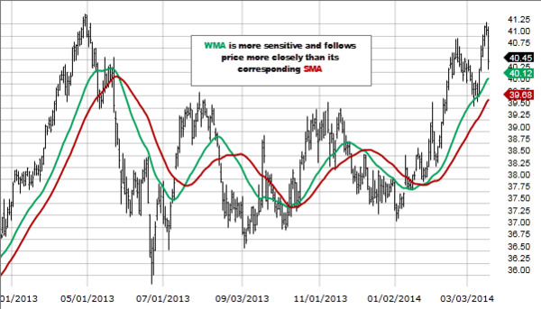
A moving average serves to smooth out the sharp ups and downs of price action to reveal a clearer overall trend. Regardless of the type of moving average, it takes a set number of data points and averages them. The resulting value is plotted on the graph. Because it isn’t graphing individual price points, but the averages of two or more, momentary spikes or drops in price are smoothed out by the other values that are being averaged.
A weighted moving average and slow moving average are often used in conjunction with each other. When they cross, the trend is thought to be reversing, and when they diverge or spread open, the trend is thought to have enough momentum to continue in the current direction.
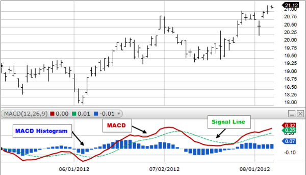
MACD
MACD stands for moving average convergence divergence. Each MACD has three numbers:
- The first number is the number of periods used to calculate a faster moving average.
- The second figure represents the periods used to calculate the slower moving average.
- The third number is the number of bars used to figure out the average of the amount by which the faster and slower averages differ.
When the line for the faster moving average and the line for the slower moving average come together, that’s called convergence. When the faster moving average line is moving away from the slower one, that’s called divergence.
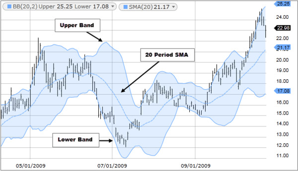
Bollinger Bands
Bollinger Bands were invented by a technical trader named John Bollinger. They are bands that overlay a price chart. They involve using a 20-day slow moving average of the closing prices on each day, dropping the earliest price, and adding the price on day 21. The standard deviation of the price is also factored in.
Many feel that as the price gets closer to the upper band, the market is in an overbought state, and as it moves closer to the lower band, it’s in an oversold state.
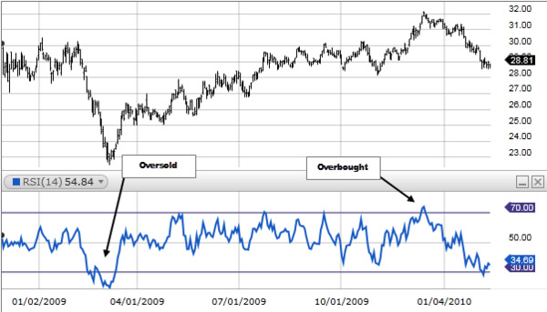
RSI
RSI stands for relative strength index, and it’s a momentum indicator used to identify overbought and oversold conditions. The bigger the price changes over a given period of time, the more the line graph travels up or down. The values range from 0 to 100. Overbought and oversold lines overlay the chart and they typically have the default values of 70 (overbought) and 30 (oversold). When the line crosses the upper, overbought, line it is said that the price may be due for downward move. The opposite is said when it crosses the lower (oversold) line: The price may be due for a move back up.
Regardless of the charts you use and how you interpret them, it’s important to trade carefully. Even though the math behind technical analysis is sound, there’s no such thing as a crystal ball when trading digital assets. Nonetheless, most traders find charts are a useful tool to help them commit to a decision to buy or sell a digital asset.
Further reading:
- Best Cryptocurrency Trading Courses, Rated and Reviewed for 2020
- Best Bitcoin Trading Sites for 2020
Stay up-to-date with all the latest trends and developments in the digital asset markets, subscribe to Bitcoin Market Journal today.